Wednesday, 5 January 2011

Flowers

I wanted to use a blossomed flower as a logo for myself, but I had some difficulties deciding on the design. This was one of them. I developed two versions because I wanted options. I used an image of a lotus flower I quite liked over the internet and began playing with some gradients. This one actually looks really nice from afar. I was tempted to keep it but decided my final design should be simple. Here's what it looks like anyway. It's still something I'm proud of.


Here's a different design for the blossoming flower.


Developed in: Adobe Illustrator CS3

Digital Painting

Here's a digital painting I did of my sister a year ago. We were in France and she posed for the camera. I thought it was a fun picture so I used Photoshop to dot out the picture. I'm very pleased with the outcome.

Reference Photo


Digital Piece


Developed in: Adobe Photoshop CS3

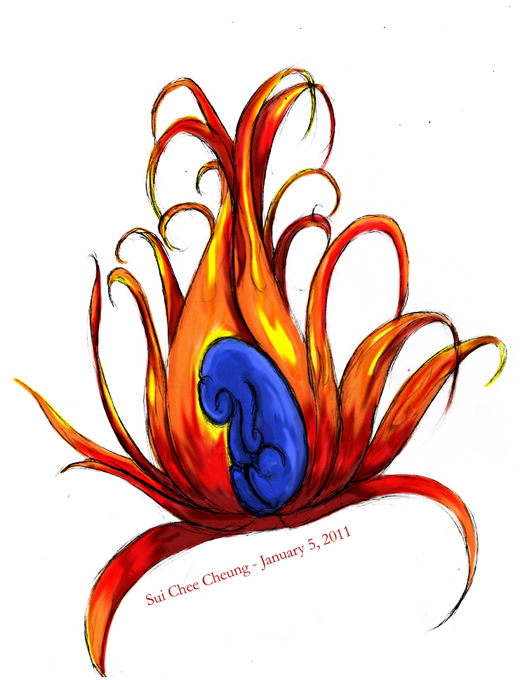
Flare Flower

This was a sketch I did a few years ago. I always wanted to colour it in, but I didn't do it until the winter holiday of 2010. I'm not that great with tablets, but tablet PCs (where you can draw touching the screen itself) made it possible. I had fun colouring this in. Using multiply modes, I was able to make a darker and lighter version.


Sketched by: Me
Coloured in: Adobe Photoshop CS3

Wednesday, 22 September 2010

First 3D piece

Completed my first 3D assignment and it was extremely fun! We had to build a snowman out of basic shapes, but I added a child because I thought it would be cute. There's a bit more texture than I expected (on the snowballs) but I really like how it came out. The monocle was fun to make. Transparency made it look more icy...well, rather than glass, but I love it anyway.


Developed in: 3DS Max

Tuesday, 21 September 2010

Kirby from Clay

Kirby was made over the summer as a gift for a friend of mine in the U.S. It's too bad I don't have a nice glaze for the acrylic paint. The lines wouldn't be as noticeable, but hey, it's cute, right?

Anyway, I started off with some tin foil and some Super Sculpey. The little guy isn't really big. He just fits in my hand. I apologize for the first blurry picture.


This is the result of cooking him for about five minutes. Because there's a ball of tinfoil inside and just a small layer of clay on top I didn't want to over do it. In fact I think his feet were beginning to burn once I took him out, so all in all I was happy with my result.


Saturday, 17 April 2010

Typography Final

Using the word 'debonair', I created a poster with its proper spelling, definition, and pronunciation. Even the grass is made from text. The clouds were done by me. It was great playing with my tablet again. I'm quite proud of these clouds since I usually don't make them look as nice as they do now.


Developed in: Adobe Photoshop CS3 & Adobe Illustrator CS3

Skate Deck Storyboard

After completing my skate deck advertising my creature, I developed a banner to promote a fake premiere of a store that sells skateboards with special designs.  Assets were provided by the client (my professor at Seneca) for the banner.  I had to incorporate a large number of the assets into the storyboard.

The final design was changed from the previous designs in various ways.  The black background gives a darker feeling.  Rather than choosing a background colour such as gray or beige, black seemed more fitting for an old monster-horror movie.

The order of the storyboard goes from left to right.


Developed in: Adobe Photoshop CS3